I'm not writing this in the way I came to the solution - it will come across far more coherent than reality. I wanted to have a nice way of displaying photos (not images/diagrams) on blog posts - and I guess this is the documented journey.
I had a little play and the default (for pelican-hss theme) actually works quite nicely. Simply put it sets the max-width of the image to 80% of the parent, which for desktop experiences is set to a max-width of 900px, and for narrower devices set to full width minus some horizontal padding.
Portrait vs Landscape
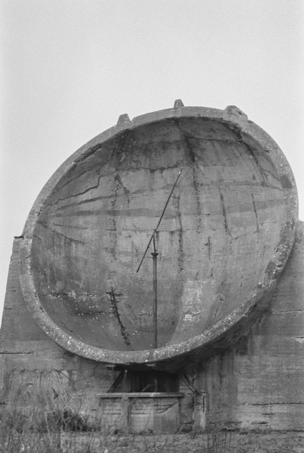
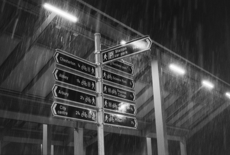
The first issue I came across was with portrait orientation photos. When we consider a desktop experience, because the width is dictated by the width of the screen, and for a portrait photo this is the short side we end up with a much larger photo on the screen. This might be ok for images in general, but because mine are photos I want them to look like 6x4's on the screen, and this means maintaining similar proportions.
In the back of my mind I knew this would be possible dynamically using javascript, but this irks me. Sites which load up looking a state and then correct themselves after a hit from JS really don't sit well with me. I'd rather tell the page what the orientation of the photo is and have it styled using CSS.
But using the pelican generator how do I tell it a photo is landscape or portrait in Markdown? I was starting to dig into the pelican source code thinking I would need to add some kind of custom plugin to decode extra syntax in the Markdown, but pondered if this might've been thought of before. Before long I found this - How to Style Images With Markdown which covered exactly what I needed.
The choice for me was the URL fragment method which I thought was quite elegant and unobtrusive. In markdown I append #portrait to the URL of the image to denote its portrait-ness.

Then add some CSS with a selector for searching for #portrait in the URL, making the max-width now 55% overriding the default 80%.
img[src*="#portrait"] {
  max-width: 55%;
}
Source Image Resolution
Based on the defaults in the theme relating to a wider desktop experience, it looked like somewhere around 900px would be a good place to start for resolution. I use the commands below to convert to either a fixed width or height of 900px (while keeping the aspect ratio) - for my film scans this seems to dump out a file around 300kb's which doesn't seem too bonkers so I leave all compression/quality parameters as default.
For landscape:
convert landscape.jpg -resize 900 out/landscape.jpg
For portrait:
convert portrait.jpg -resize x900 out/portrait.jpg
Lightbox
When a picture is small you want to click it to make it bigger. The UI I like for this is termed a 'lightbox' where an overlay (modal) takes up the entire screen with the photo as big as possible centred in the middle of the screen. This how-to demonstrates the functionality I'm looking to achieve - and most of the code is good to go.
The main modifications are just making the Javascript more generic - I added code to find all the images in the article and add the click handler (of course requiring a callback for the DOM being ready first). I got 90% of the way towards my lightbox very fast, but then spent the best part of a week on or off getting that final 10% right.
Starting from the desktop experience, as discussed the lightbox puts the photo in the centre of the screen and makes it as big as possible. In the how-to example this is somewhat achieved by setting the width and max-width properties of the image to 80% and 700px respectively - the logic of this in English is that the width of the image should take up 80% of the parent size, up to a maximum of 700px (this can be achieved the other way too). This is pretty good but only scales and centres horizontally, which is particularly problematic for vertical mobile devices.
A quick google on how to centre vertically and horizontally brought me to this handy little guide, which suggests a transform if the element is of unknown width and height (which I think as we will be using percentages rather than pixels this makes us fall into this camp). It uses position: absolute and the top and left properties both set to 50% which sets the top-left corner of the element to the middle of the parent. It then uses transform to translate the element right and up 50% - although this time the percentage is of the element size not the parent which puts the element directly in the middle of the parent (in our case the screen).
Initially I set the image to be 90% height and 90% width - but this has a stretching effect and doesn't maintain the aspect ratio. So I came to the conclusion that I'd have to set the percentage to one axis and have the other auto, deciding which way round depending on the aspect ratio of the screen and photo. I would then use max-width/max-height set to the natural size of the image to ensure it didn't blow up beyond what was natural and look bad. I actually had the Javascript code for this all written and working well. It came with the caveat that it required knowledge of the natural image size and screen size which caused me issues on orientation changes...
Then after another rabbit hole of searching how I could remove the requirement of knowing the natural image size I found a subtle change simplified everything in a way almost too good to be true. It transpires if I set the max-width to be 90% as before I can then set width to be auto which essentially means 'expand up to the natural size of the image'. The beauty is that I can do this for max-height/height too, whilst maintaining the aspect ratio. Bingo.
Alternative Option
Although very happy with the solution above, I happened to stumble upon a very similar setup (website not disclosed) and had to have a peak at how it was achieved. The key it seemed, was the use of a property called object-fit, specifically the value object-fit: contain - which content is scaled to maintain its aspect ratio while fitting within the element's content box.
Nothing is perfect and the issue I've found is that I'm unable to set a maximum size for the image, which means on large screens it would stretch and quality would be impacted. It is also not supported on IE... but I think I can live with that. Before I came to my refined solution above this was definitely a nicer/cleaner way of achieving what I wanted. That said, the object-fit offers other values other than 'contain' which look very useful and will be keeping my eye on.
Example Photos


Top ^